The Golden Thread
UI/UX, Website, Brand Identity, Marketing
Jul 2024
Program Used: Illustrator, Photoshop, Figma, After Effects
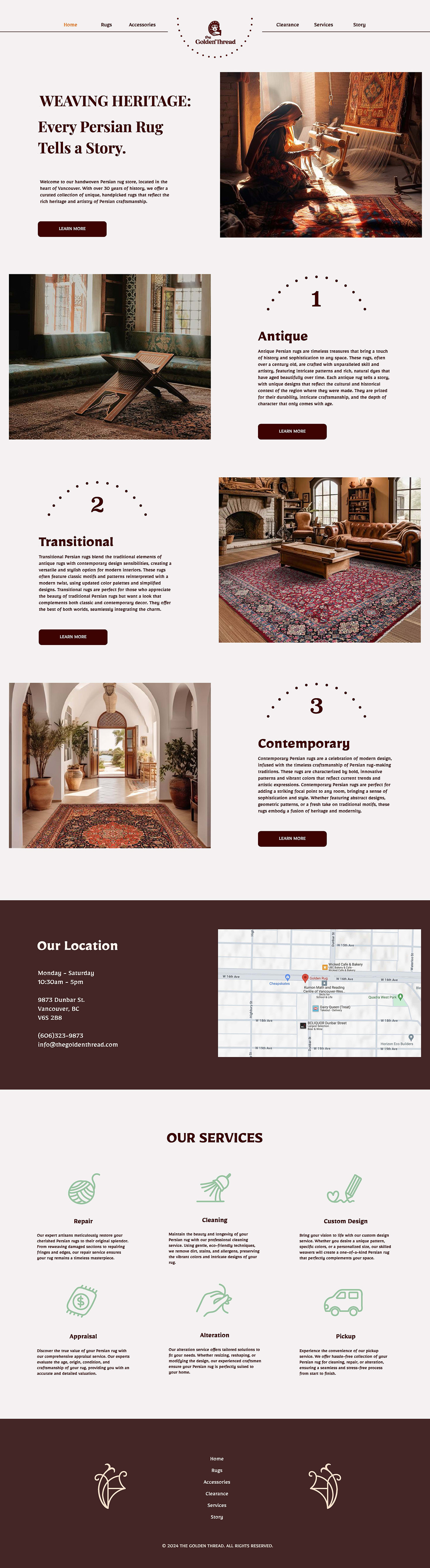
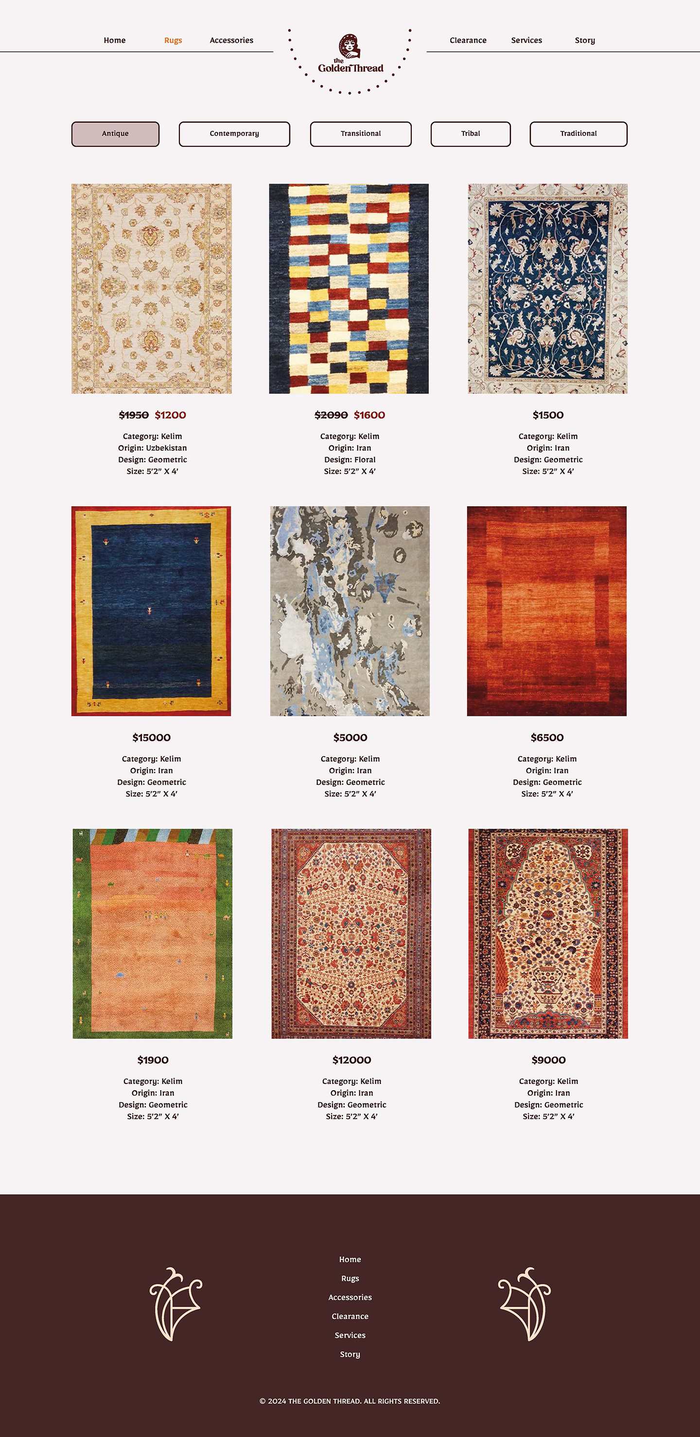
This project involved the rebranding of a handwoven Persian rug store located in Vancouver. Through in-depth research on the niche market and the incorporation of the brand's 30-year history, a new brand identity was created. The main deliverables include the logo, stationery, advertisements, landing page, packaging, website, and more.
Brand Story
A fine handwoven Persian rug can take years to complete, with each piece embodying a unique story of culture, family, and the artisan’s journey. The family business, rich in the history of carpet making, is dedicated to preserving and celebrating the beauty of this timeless art. Each carpet carries memories, connections, and historical significance, deserving of the utmost care, love, and expertise. They serve every carpet enthusiast with an exquisite eye, ready to dive into the intricate art and heritage of Persian rug making.
Key Messages
Connecting the Charming Persian Carpet Art with Carpet Enthusiasts
They serve as a bridge between the enchanting world of Persian carpet art and those with a discerning eye for beauty. Each carpet is more than just its origin and materials; it’s about the artisans behind it, many of whom are women. This art form is deeply intertwined with family traditions and can be passed down, creating lasting connections and cherished memories.
SCROLL TO READ↓
Logo
The design approach focuses on the cultural background and storytelling of the brand. I explored many ideas to achieve the goal, including the symbolism in Persian carpets, Persian knot patterns, and woven features. Ultimately, I emphasized the "female art" and handwoven aspects of Persian carpets, as the brand's most unique selling point is its distinctive, handpicked, handwoven rugs. The history and story behind each carpet are crucial elements of the brand image. This concept is inspired by the tradition of inheriting the art form, where most carpet artisans are women who learn the craft by watching their mothers from a young age. This knowledge, passed down through generations, evolves with each artisan’s experience, making Persian rug weaving a cherished and predominantly female art.
The final design features a Persian girl weaving rugs, subtly forming the shape of a “G.” Her facial features and hairstyle are inspired by ancient Persian women, drawing from ancient Persian drawings, statues, and photos, which include an oval face, high and narrow nasal bridge, round and deep-set eyes, and curly hair. The woven pattern connects with the paisley pattern on her headband, creating visual continuity and interesting movement. The sharp edges on her shoulder and hand echo the anatomy of the “G” letter in the wordmark.
The wordmark is customized from an engraved serif font, maintaining a crafted feel. The high stroke contrast conveys elegance, aligning with the niche, high-end market positioning. The connections between letter “d” and “e” illustrate the movement of weaving and thread. To reduce the width of the long brand name, the word “the” is placed between the icon and the wordmark. The scale and spacing are carefully adjusted for balance and readability.
Colour Palette
The color palette is inspired by the rich hues commonly found in Persian rugs, with red and gold being the most distinctive colors. This combination of primary, secondary, and accent colors evokes the essence of Persian rugs, imparting an antique and extravagant feel. The brand icon should always use the Ruby Pomegranate color against a contrasting background. When placed on a dark background, the Sunlit Saffron color should be added to enhance visibility. The icon also works well against a light background.
Red - Associated with feelings of passion and vitality. Red is also the color of blood and fire, two powerful symbols and forces of nature. In Asia, red also symbolizes luck. It is customary for many Asian brides to adorn themselves in red when they marry.
Gold/Yellow - In Persian culture, they associate the color yellow with radiance, such as the light from the sun or the joy of living. Gold symbolized wealth, power and prestige in old designs. Due to its esteemed reputation, gold was only featured in Persian rugs designed for royalty or prominent families.
Green - Mohammed’s favorite color was “emerald green“. Partially because of this, not many everyday Persian rugs are not likely to feature such a prestigious and sacred shade. That said, you do see extravagant Persian carpets that feature green colors.
Brown - The color of soil, brown in Persian rugs represents the mother planet, Earth, and serves as a sign for fertility. Brown shades in ancient designs were derived from tree bark and walnuts, which were available in great abundance throughout the Orient.
Beige/White - White is universally accepted as the color of purity and innocence. Persian weavers held this same belief, and white was often mixed with beige to create various designs.
Typography
Begum is an engraved serif typeface that blends classic and modern elements. It conveys the brand’s antique and authentic feel while offering excellent usability and legibility for web and mobile. The script characters and use of dots add a soft touch, making the font more friendly and inviting.
Brand in Use
In addition to the icon, a versatile symbol shaped like a “G” was created. The pomegranate is a common symbol in Persian rugs, representing fertility due to its abundant seeds, and also lends its name to the primary color. The symbol incorporates pomegranate motifs and other plants with slender stems, conveying a feminine feel.
Creating this symbol and pattern was a significant challenge. The original symbols on Persian rugs that inspired me were either too tribal or too complex, which didn't align with the brand image or the need for versatile uses. Geometric symbols were too dull and off-theme, while floral symbols risked appearing dated and overdecorated. Stressing the “G” concept was a breakthrough. This approach allowed me to create an elegant pattern and use the symbol independently across stationery, packaging, and advertisements.
The dashed half-circle around the logo enhances its shape according to Gestalt principles and echoes the “G” shape. Adding this visual element helps avoid overuse and introduces variations to the logo.
For the stationery design, the logo and symbol are used in pairs to create visual harmony. The logo works well at a small scale, while the symbol can be used at a larger scale and with varying opacity to establish hierarchy. The logo is most effective on a Ruby Pomegranate background with ample spacing around it, a feature I emphasized throughout the design. The overall mood is neat, elegant, and exquisite.
The invoice design maintains a luxurious feel, with ample spacing for the logo and graphics. Given the high order price and typically small quantity of purchases, the space allocated for order information is sufficient in most cases, allowing more room for brand presentation. For the packaging, a custom ribbon, box, and stickers were designed to meet the unique needs of the business. To accommodate services like repair and cleaning, tags featuring the logo and blank space were created to enhance brand recognition.
Ad Campaign & Landing Page
The purpose of the ad campaign is to celebrate the grand opening and attract traffic to the store. Given the brand's story-oriented focus on individual carpets, I derived a narrative from a Persian carpet and transformed it into an interactive game. The background story features four powerful ancient creatures—Div, Dragon, Lion, and Rabbit—biting each other in a circle, symbolizing the philosophy of balance and the cohesion of nature. Viewers are invited to participate by picking a lucky symbol on a fortune wheel and visiting the store to claim a keychain of that symbol.
An animation of the fortune wheel was created to showcase the interactive process. The creatures are hand-drawn in line with the brand aesthetics, with added details like gradients, shadows, and decorative lines to create a textured and mysterious scene. The movement of the fortune wheel mimics the natural motion of a mechanical wheel, with a slight shake at the end. A green colour and embellished lettering are used for the title to attract attention. Besides the Instagram story, the campaign also includes magazine catalogs and direct mailers to reach the target audience effectively. Different layouts are applied to each medium to best present the information.
Landing Page
After clicking the button or scanning the QR code in the ad campaign, participants are directed to a landing page that showcases the full background story, game rules, and an introduction to the store. This page maintains the visual style of the ad campaign and is organized in a clear sequence to guide viewers. To keep viewers focused on a single task, the page is set to a fixed width with a black background. The heavy texts are arranged using background images and custom icons. A decorative floral pattern in the footer reinforces the brand image and highlights the subordinate section.
Summary
Working with saturated red and yellow can be challenging due to the importance of color proportions. In this project, yellow only complements red effectively in small amounts, making it crucial to find the best balance. For a niche market, identifying unique scenarios and creating distinctive symbols helps make the designs engaging.
For the website design, balancing brand awareness and usability is the main challenge. It's essential to use space wisely for both functional and visual purposes, and to test text readability on dark backgrounds to avoid extreme contrast. Finding the right images is also important. Limited access to high-quality images of Persian carpets constrained the ad campaign design, which would benefit from better photographs.